Before creating a visual system, I want to clarify a few things: what the business intends to do, who it mainly wants to reach, what those people should understand, and what they should be able to do next.
With those answers, design choices become easier to assess. What the headline should say first, which information deserves emphasis, where an image belongs, and where a button leads all have a basis.
If the intended meaning keeps changing, the visual work is hard to stabilize. Planning may describe one business, the writing emphasize another advantage, and the design suggest a third impression. Considerable work goes into each part, yet the whole remains unclear.
I find it useful to organize this process into six layers: strategic intent, audience tasks, value proposition, content structure, visual rules, and context of use.
Each layer should address the question passed down from the previous one and provide a usable answer for the next. The answers are then checked in the setting where the work will actually be used. This is a working model for organizing and reviewing design decisions.
1. Turn the business direction into requirements people can discuss
“We want it to look more professional” can start a conversation, but it does not yet provide enough direction for design.
What should professionalism show through? A clear service scope, an understandable delivery process, or information that can be checked? Different answers lead to different content and visuals.
Strategic intent should first establish the problem the business currently addresses, the people it serves, the capabilities that support continuing operations, and the part of that work this communication should undertake.
Current capabilities and future direction also need to be separated. Services already available need supporting information; capabilities still being developed should retain their planned status. Presenting the future as the present makes a polished design more likely to mislead readers.
For a specific design task, I would narrow the scope further. A company introduction may help newcomers understand the business. A product page may help people with a defined need assess suitability. Partnership material may explain responsibilities, conditions, and the next step.
Let one piece of communication perform one main task well. Once the task is clear, there is a starting point for deciding what to emphasize and what to place later.
2. What each of the six layers needs to clarify
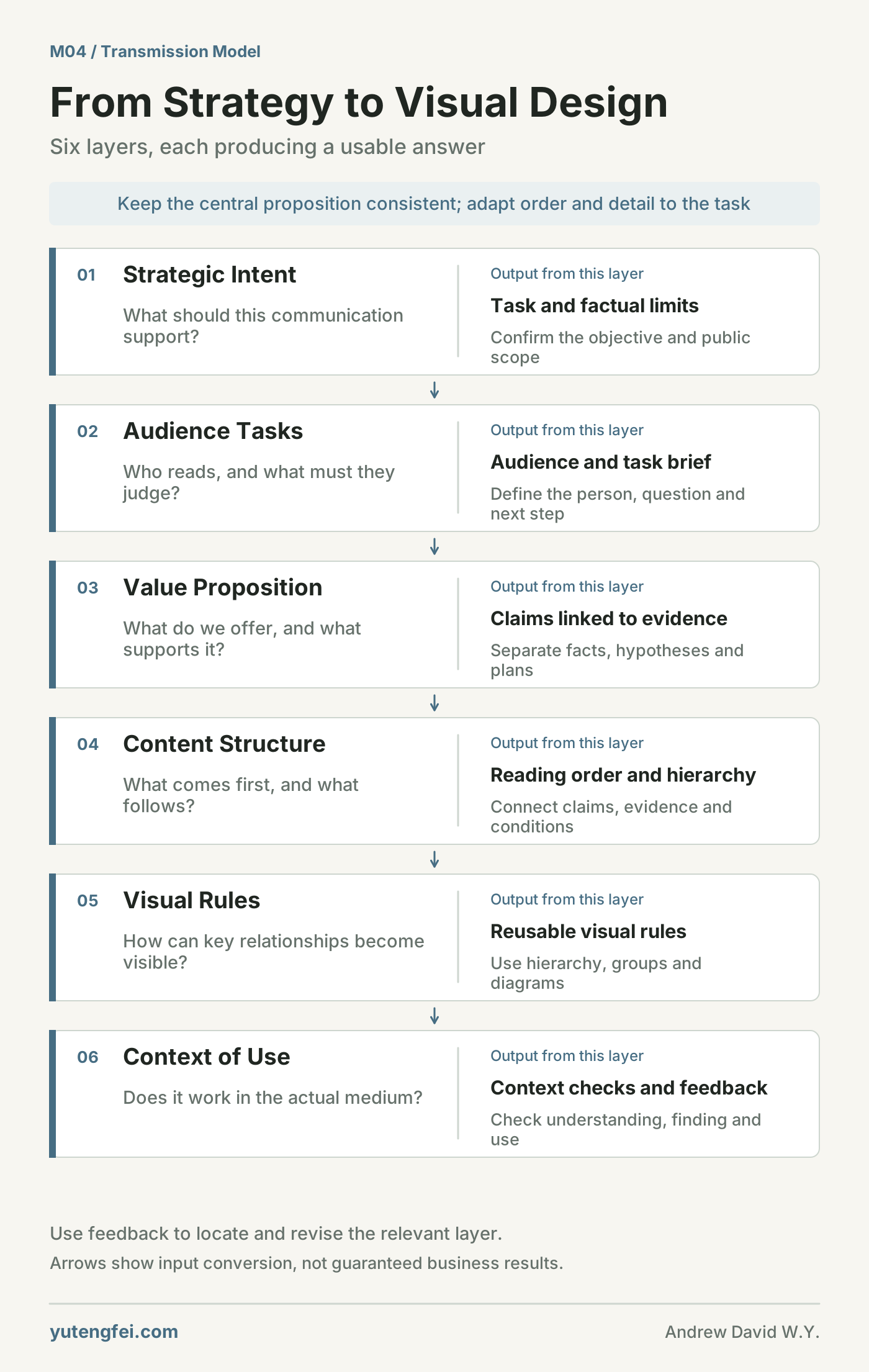
Figure 1: Downward arrows represent the conversion of design inputs from one layer to the next. They do not mean that completing a layer necessarily produces business results. Feedback from use supports review and revision at the relevant layers.
Layer 1: Strategic intent—what should this communication support?
This layer establishes direction and boundaries.
The market the business hopes to enter, the capabilities it relies on, and the communication problem it most needs to address should be clear first. At minimum, the design team needs an agreed task brief: what the work should achieve and what it cannot yet promise publicly.
The brief need not be long. Helping participants reach a similar understanding of the objective is more useful than filling it with grand concepts.
Layer 2: Audience tasks—what question does the reader bring?
The same business may address customers, employees, suppliers, and other partners. Some concerns overlap, while others have distinct priorities.
Customers may first ask whether an offer suits them, how delivery works, and what happens when something goes wrong. Suppliers may focus on what they must provide, how coordination works, and settlement terms. Employees may want to understand roles, work standards, and available support.
So “who will read this?” should lead to “what judgment do they need to make?”
Even the same person has different tasks when first learning about an offer, comparing options, and preparing to cooperate. Making those differences explicit helps place information where it belongs.
Layer 3: Value proposition—why is it worth learning more?
The value proposition should connect the audience’s problem with the help the business can provide.
If reliable delivery matters most, explain delivery arrangements, responsibilities, and exception handling. If the reader needs to assess suitability, clarify scope, conditions, and circumstances in which the service does not apply.
Words such as “efficient,” “professional,” and “reliable” can be used, but they need support. Relevant practices, records, and the extent to which they can be verified determine how far a claim can reasonably go.
Review the claim and its evidence together. Some claims have factual support, some still require validation, and some express a future direction. Distinguishing them gives the subsequent communication a sounder basis.
Layer 4: Content structure—in what order should the reader understand?
A business usually has plenty of information. A visitor to a page may not be willing to read all of it from beginning to end.
Content structure determines which question to answer first, what evidence follows, what can be expanded, and what needs a separate entry point.
For a service page, begin with the problems it addresses, explain the way of working, then provide deliverables, conditions, and relevant information, followed by a clear next step. Readers can follow their questions or go directly to the part they need.
Headings help organize understanding. The headline, summary, diagram, body, and buttons should work together around the same task. Placing every piece of business information at the same level leaves the reader to classify it again.
Layer 5: Visual rules—how can important relationships become visible?
At this layer, choices become specific: type size, color, spacing, shapes, images, alignment, and motion.
Size and position can signal reading order, spacing can group information, lines can explain relationships, and color can distinguish states. The role of each device should be understood before it is chosen.
A page explaining an implementation process should make steps, responsibilities, and conditions easy to distinguish. Information that needs checking requires accessible sources, explanations, and download links. Mobile text should wrap naturally, and buttons should be easy to reach.
The meaning of color and form depends on context, combinations, and actual use. A particular color cannot, on its own, establish a business’s scale, capability, or credibility.
Shared visual rules can make different pages belong to one system. Specific layouts should still follow their tasks. Introductions, process diagrams, reading pages, and operational interfaces can share a visual language while arranging information differently.
Layer 6: Context of use—does it still work in the actual setting?
A desktop page may have a different reading order on a phone. A diagram clear on a large screen may become illegible as a chat preview. Material explained verbally at a meeting may lack necessary context when sent to someone reading alone.
These situations need checking in the actual medium.
Ask someone new to the subject to read it and explain what they understood. Ask someone with a defined task to locate information. Put the file into its real display size and check whether the text, relationships, and entry points remain clear.
Across settings, the facts and central proposition should remain consistent. Heading order, length, and interaction can change to suit the task.
3. Connect the six layers through a fictional example
Suppose an equipment-maintenance business is preparing a service page. This situation is invented solely to explain the model. It represents no real project and assumes no conversion result.
The page is mainly for equipment managers assessing whether the service applies. They need to confirm the problems covered, how to submit a request, who will handle it, and which cases require separate assessment.
The six layers can connect as follows:
| Layer | What needs to be established | Specific implication for design |
|---|---|---|
| Strategic intent | Help potential customers assess suitability and submit necessary information | Organize the page around suitability and preparing a service request |
| Audience tasks | Check equipment types, problem scope, conditions, and submission steps | Put answers where readers can readily find them |
| Value proposition | Receive and handle requests within a defined scope and agreed process | Support the claim with actual processes and conditions; do not promise unconfirmed response times |
| Content structure | Scope → process → required information → conditions → contact | Follow the decision process and expand details when needed |
| Visual rules | Distinguish steps, conditions, and exceptions; make key entry points visible | Use hierarchy, grouping, and a simple process diagram |
| Context of use | Managers may read on phones and forward the page to colleagues | Check narrow-screen reading, submission, and completeness after forwarding |
Now a shared basis exists for discussing button size or whether a process should run horizontally or vertically. The team can compare options against the reader’s task and device conditions.
Any new service promise on the page also needs to be traced back: can the business currently deliver it, is there a supporting process, and has the responsible person confirmed it? Each important statement in the design should have a traceable basis.
4. When feedback arrives, identify the layer involved
When someone says, “The design does not quite work,” ask for more specificity.
Is the text hard to see? Is the emphasis unclear? Is the business difficult to understand? Is the next step missing? Or does a statement lack evidence? These issues need different changes.
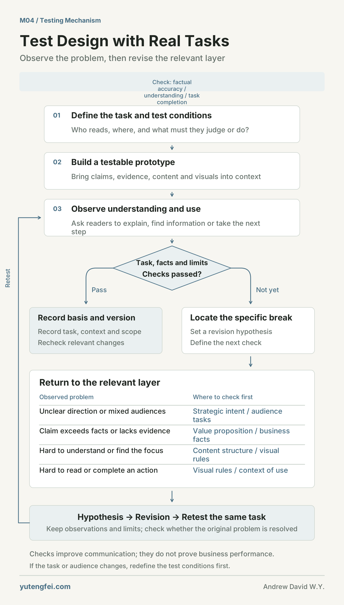
Figure 2: Testing starts with a task defined in advance. A failed check leads to diagnosing the break, revising, and testing again. A passed check is recorded with its scope and version. This is a work-review process, not a forecast of business growth.
If text is difficult to read on a phone, inspect size, contrast, and layout. If readers still cannot explain the service, revisit content structure and the value proposition. If a claim exceeds actual capability, check the business facts first. If contact details and an entry point exist but submission fails, inspect the usage flow.
Sometimes the problem sits earlier: a page is trying to serve several very different audiences without a main task. Local adjustments cannot easily resolve the disagreement; strategic intent and audience tasks need to be reconsidered.
Each revision should have an explicit hypothesis. For example: “Readers cannot find service conditions because they are buried in a long paragraph.” Separate the conditions into a group and test the same task again. If the audience or task itself changes, update the test conditions first, rather than judging a new task against an old standard.
Observations from a few people can reveal problems, but cannot establish effectiveness for everyone. Clicks, time on page, and inquiries also need interpretation alongside traffic sources, tasks, and page changes. Business results depend on the service itself, price, channels, and execution as well as clarity of expression.
5. Keep design decisions so others can continue the work
If each revision leaves only a new file, the reasons behind the choices become difficult to recover later.
I suggest keeping a simple record of important decisions. When someone takes over, adds pages, or introduces another language, they can continue from the same evidence.
| Record | What to clarify |
|---|---|
| Task and audience | Who the material primarily helps, and what judgment or action it supports |
| Claim and evidence | What is being stated, which information supports it, and what remains unconfirmed |
| Content and visual choices | Reasons for the sequence, grouping, and emphasis |
| Context and test method | Device or medium, participants, and tasks used for checking |
| Observations and limits | What was actually found and which situations remain uncovered |
| Revision and version | Which layer changed, who confirmed it, and when to check again |
There is no need to turn every detail into a report. Begin by recording decisions that affect direction, understanding, and use.
As the business changes, related content needs to change too. An old page may still look good, yet require review if its scope, data, or service conditions are outdated. Maintaining these connections is part of communication work.
6. Clarify complex relationships, then draw them
This model also fits the thinking process of “map the complexity, simplify the structure, make it understandable, and express it visually.”
First lay out the business, audiences, tasks, evidence, channels, and conditions of use. Then identify the six layers and the connections that matter. Turn each layer into specific questions and checkable outputs. Finally, use diagrams to show the transmission, breaks, and feedback.
A diagram helps discussion when it compresses logic that has already been explained. Each node needs a clear meaning, and each line an explainable relationship, so readers can use it to review their own work.
I want good communication to invite attention and stand up to questions: why say this, why arrange it this way, what supports it, and who is it for?
Connecting these relationships layer by layer gives planning, writing, and design a shared basis for discussion and continuing revision.