BiFENG’s visual identity: starting with KING’s strategy map
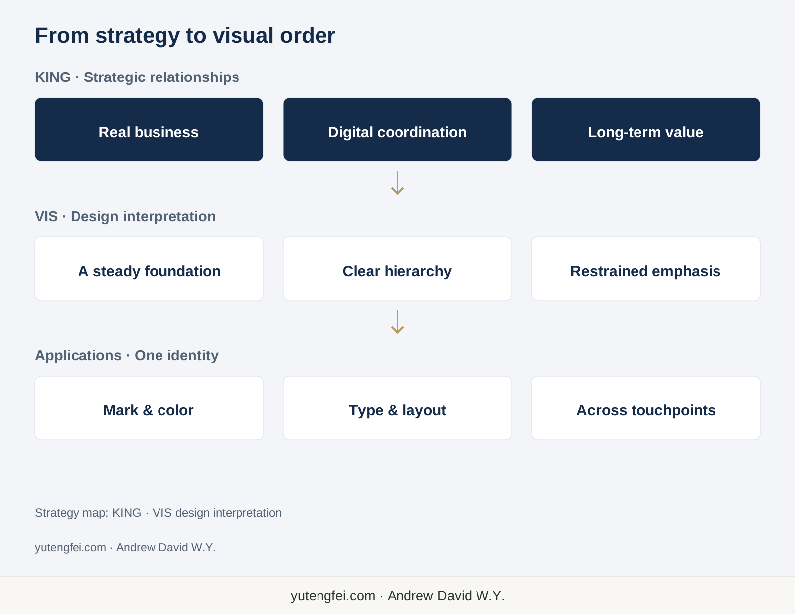
KING’s strategy and mechanism map provided the starting point for BiFENG’s visual identity. I look at how real business, digital coordination and long-term value informed the navy-and-gold palette, mark, layout and applications.
Understand how the business works before deciding how it should look
When putting together BiFENG’s visual identity, I started with the strategy and mechanism map developed by KING.
It connects real consumption, the platform and supply chain, product brands and business operations, operating results, and then capital connections and global cooperation. The seven partner roles, contribution assessment and the matching of responsibilities, authority and interests sit in the same picture.
I think this gives the design a useful starting point. The image BiFENG presents should relate to how it intends to operate and organize cooperation. The visual identity grew from that thread.
For me, a visual identity system, or VIS, is a shared visual language for a business. Its mark, colors, type and layouts, through to cards, reports, websites and event materials, should be recognizable and help people understand the content.
How strategic relationships inform the design
Two threads in KING’s map stand out to me. One links value created by business operations with capital that supports industrial development. The other records and assesses contributions, then arranges interests and cooperation according to roles, responsibilities and agreements.
“Co-create value, share growth” has a concrete explanation here. There is a place for who participates, what they do, how they cooperate and how that cooperation continues.
So I wanted the identity to feel steady, clear and orderly, with room for different businesses and partner roles. A report, website and event should feel part of the same system.
Some capital routes and mechanisms in the map are to be developed in stages. The design can express direction and confidence. It must also keep plans distinct from achieved results, and shared value distinct from a promise of returns.
Why navy and gold
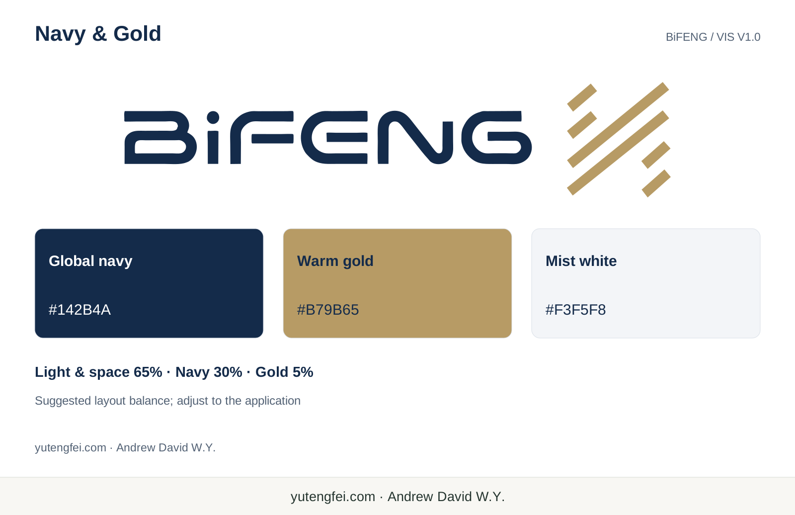
The main color is global navy, #142B4A, with warm gold, #B79B65, and mist white, #F3F5F8, for content backgrounds.
I want navy to give the identity a steady base. It suits group identification, business documents and material about industry and capital. It carries weight while allowing readers to concentrate on the information.
Gold appears in the symbol and a few important details. Restraint makes the identity clearer. Titles, figures and charts each need their own hierarchy; every element cannot demand equal emphasis.
Mist white and empty space matter too. BiFENG’s material already covers industries, platforms and partner mechanisms. The page needs room for that information. The manual’s suggested balance of 65% light areas and space, 30% navy and 5% gold helps control emphasis. Each application still needs its own judgment.
A recognizable mark that remains usable
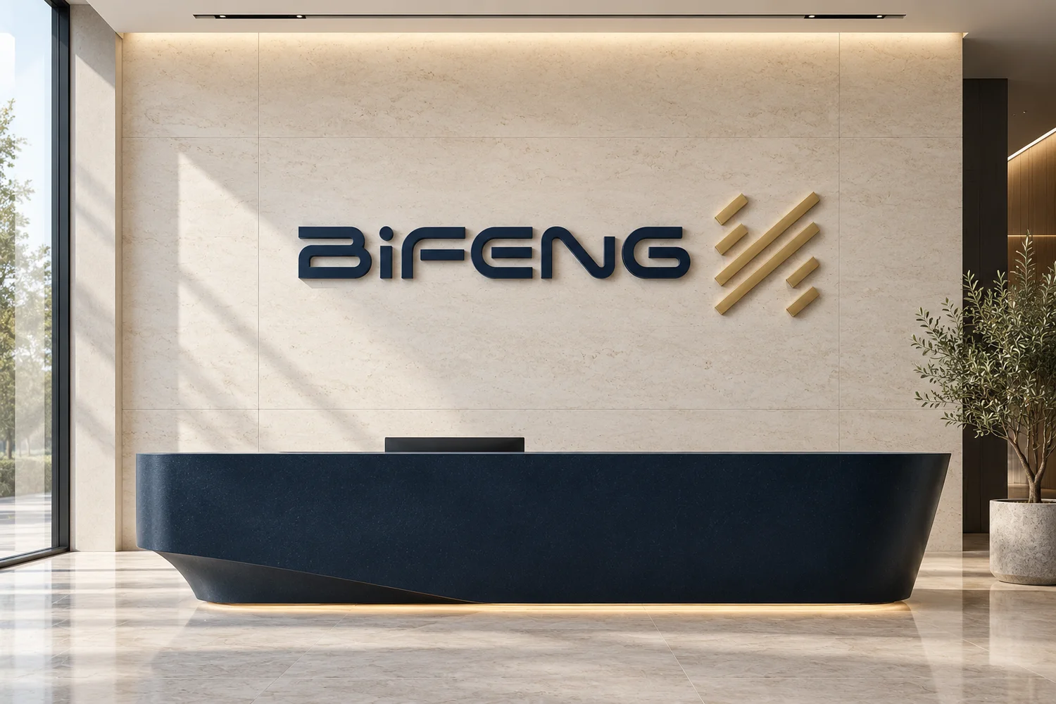
The core identity combines the custom BiFENG wordmark with the mirrored six-line symbol on its right. The lowercase i, its dot, the letter breaks and the lockup come from the master artwork. Retyping the name in another font would lose those details.
The symbol has two long and four short lines extending toward the upper right. I relate its parallel rhythm, extension and visual correspondence to cooperation and long-term growth in the strategy map. That is my interpretation for this design; it does not assign one business or partner role to each line.
In use, we also need to ask whether it is legible at a small size, whether print fills in the gaps, or whether embroidery joins the breaks. Clear space, minimum sizes, light and dark versions and monochrome versions all need to be considered together. Recognition has to survive repeated use.
Taking the identity into actual objects and pages
I care about whether the design stays consistent when it moves between different formats.
A card should make a name and contact details easy to read. A report should make its subject, version and date clear. A presentation should organize ideas, evidence and charts. An event backdrop needs to account for viewing distance, where people stand and photography. On a phone, text size and crowding matter.
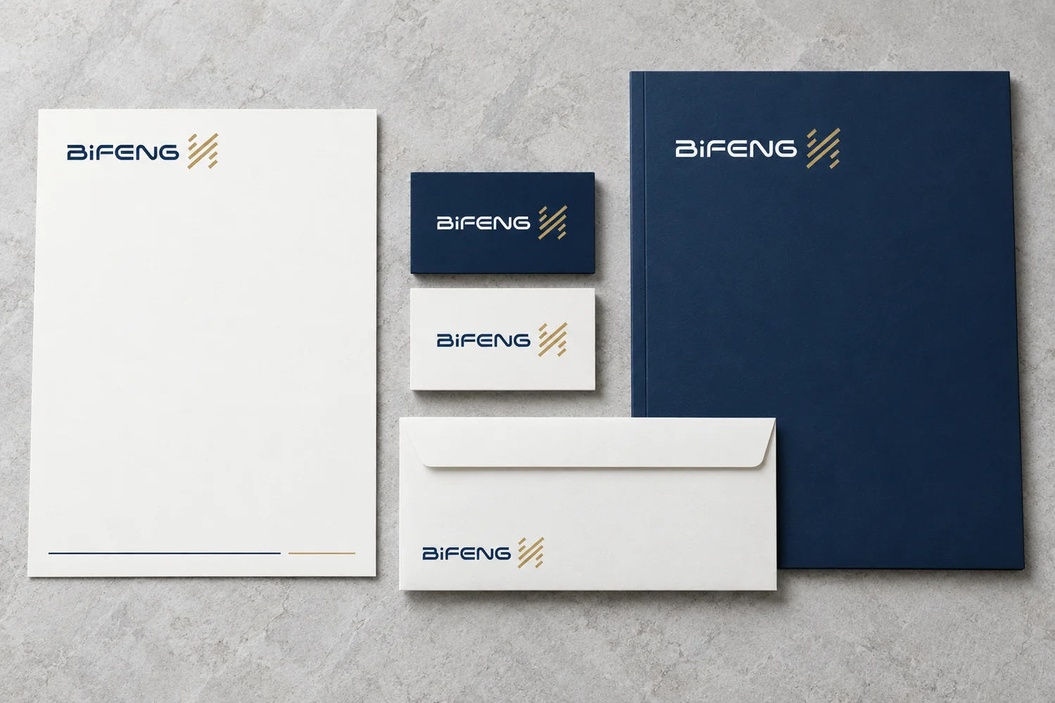
This manual connects cards, stationery, reports, digital interfaces and event materials, then extends the system to office items, clothing, cups, badges and flags. They share the mark, colors and basic order, with adjustments for their particular use.
The result I want is straightforward: the objects can differ, and people can still recognize BiFENG.
Execution has to follow the design
Version 1.0 establishes a common foundation for the mark, palette and applications. Its dimensions, layouts and production recommendations still need checking against suppliers, materials and physical samples.
Gold on a screen, gold-colored ink, foil and a metal sign will look different. We need to review a physical sample before approving a production run. The application images in this article are AI-generated concepts from the manual’s accompanying assets. They support discussion of the design direction; they do not show items already produced, installed or in use.
KING clarified the strategic relationships first. We then translated them into a visual language that people can see, read and use repeatedly. That process is what I most wanted to record about BiFENG’s identity work.
The website, presentations, reports and event materials can develop from the same standards. The visual work should make the business’s intended direction easier to understand.
Based on the BiFENG strategy and mechanism map developed by KING and the BiFENG Visual Identity Guidelines, Navy & Gold V1.0. Strategy-map planning is credited to KING. This article records the VIS concept and design thinking. Application images are AI-generated concepts supplied with the manual.